Dark Cloud
Bank Australia recently moved into their new B Corp Building in Collingwood, a 6-star Green ‘Design and 5-star NABERS rating.
The brief was to connect employees and visitors to the impact-driven projects that Bank Australia invest in. Specifically, their 2,117 hectare conservation reserve in western Victoria.
Silver Lining
The strategy was to bring the outdoors to life indoors. Connecting two floors and the roof garden with multiple sensory flora and fauna.
The challenge was that the building was designed with no straight edges. Every wall, every meeting room window and office was curved. In order to bring the outdoors-in, a mixture of foliage and large wall vistas were installed ensuring all were in proportion to the office space and people within it. Colour coded zones were created representing ocean, forest, conservation reserve and desert. Each zone housed corresponding landscape vistas.
Then feature walls were layered with audio-visual interactivity. Laser GOBO technology was used to create subtle fleeting movements on the static walls: such as seabirds, dragon flies, dolphins, and kangaroos.
⇲
A time sensitive light wall was installed, that mirrored the light of the reserve in real time from dawn to dusk.
⇲
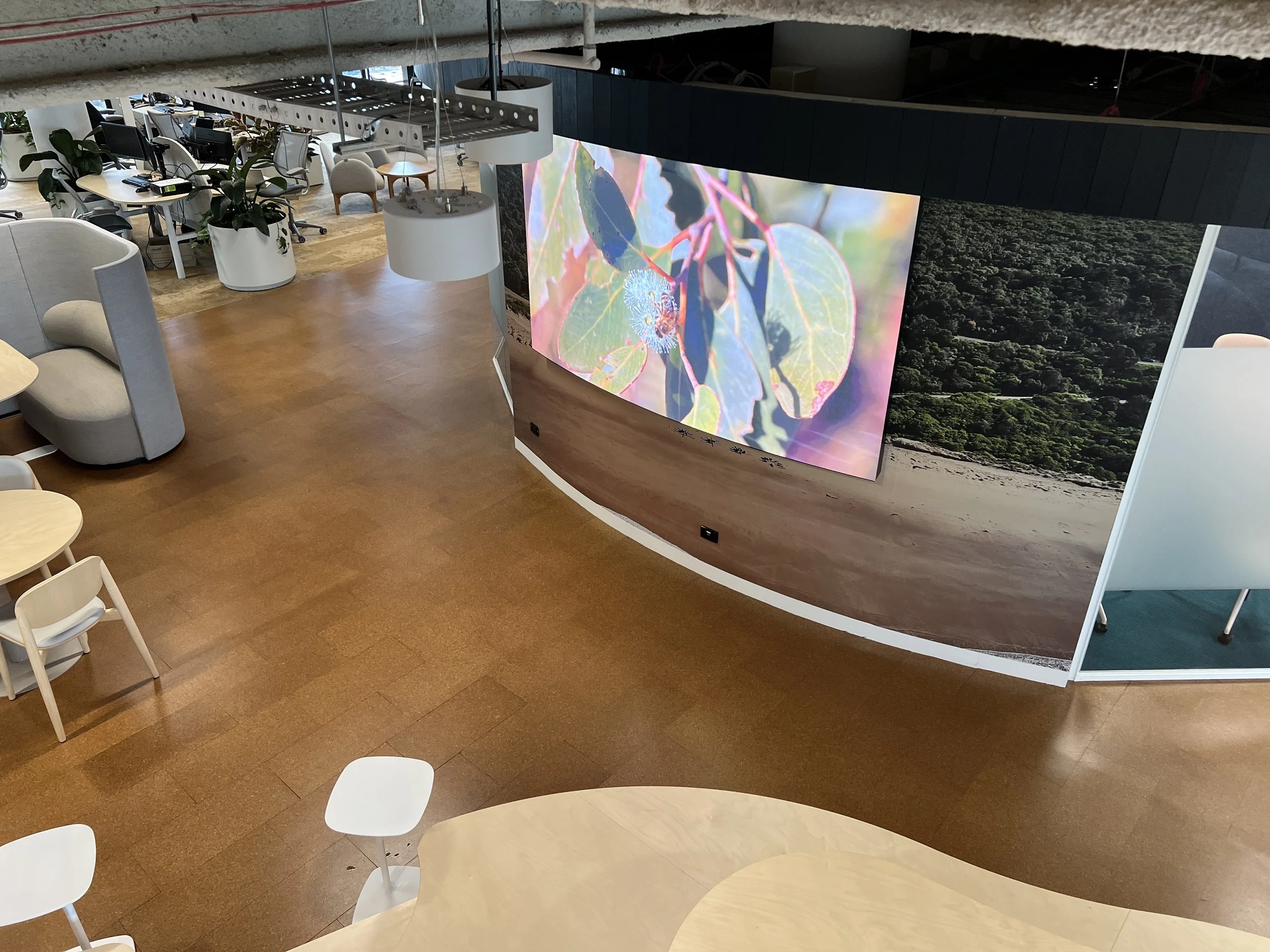
Two huge curved screens dominated each floor and reception, displaying landscape footage from around Australia. The reel show footage that circulated the office around Australia highlighting impact areas such as
the Otways, Grampians, their conservation reserve and the Daintree Forest.
⇲
Outside of the lifts, six speakers were installed to play directional and separated sounds from the reserve so that as you enter the floor from any of the four lifts, you hear sounds like a flock of cockatoos pass you in real time. For this, sound engineers spent three days at the reserve capturing the reserve throughout the day so sounds could be pulsated in real time.
The meeting rooms were named according to the animals of the reserve and along with their indigenous name. Frosting was designed as the opposite to the in-proportion wall art. Macro detail such as an emu quill, dragon fly wings and goanna skin were used to create privacy screens. These designs were then used on the company lanyards and stationary. Each employee received a welcome pack that included water bottles, a rucksack and loaded coffee cards made from recycled seeded paper.
Creative | Silver Lining
Sound and Lighting Design | Sound Environment
Design: Matt Clare (Mono Design), Aimee Alta


